Motivation
If you don't know what Cara is, it's a portfolio and social network platform for artists, focusing on human-made art.
We do not agree with generative AI tools in their current unethical form, and we won’t host AI-generated portfolios unless the rampant ethical and data privacy issues around datasets are resolved via regulation.
As soon as I saw that this platform existed, and because I agreed with its stance, I moved my small amount of art from Instagram to Cara.
One problem though, I noticed I can't add alt text to my images...
This got me thinking, is the alt text enough? Are there other barriers preventing users with disabilities from using this platform?
To find any other barriers, I've decided to analyze the overall accessibility of this platform. This analysis is also known as an accessibility audit.
Accessibility audit
Scope
Since analyzing the entire website would be extremely time-consuming, I decided to only look at the profile page when not logged in, because this is most likely to be found via social media and could be a new user's first interaction with the platform.
I'll also ignore the mobile apps for now and only look at the web implementation.
Legislation & requirements
Since I'm accessing this website from Europe, I will keep in mind the European legislation at the time of writing.
There are 2 main laws, one for the public sector and one for the private sector.
- The first law, Directive (EU) 2016/2102, mentions the technical requirements of the Web Content Accessibility Guidelines, specifically, WCAG version 2.1 level AA. This law has been in effect since 2020.
- The second law, Directive (EU) 2019/882 will go into effect in June 2025.
Sites such as Cara fit the second law. To be on the safe side, the platform would have to comply with WCAG 2.1 AA.
Even without legal obligations, this website should be accessible to anyone interested in art, including people with disabilities.
Automated testing
For this article, I decided to go with Axe Dev Tools. If you want to see the findings below for yourself, you can install this extension and run it on your Cara profile page. I also used the Headings Map extension.
Manual testing
Since automated testing can find at most 40% of all accessibility issues (according to this Study by gov.uk), I also did some manual testing:
- Keyboard navigation - Can power users (keyboard only users) use this website?
- Screen reader navigation - Can screen reader users with partial or total vision impairments use this website? Software used: NVDA on Chrome
- Voice Access navigation - Can a user with motor impairments use this website? Software used: Microsoft Voice Access
Findings
-
<html>element must have a lang attribute. 3.1.1: Language of Page (Level A)- Found via: Automated testing
- Impact:
- Without the lang attribute properly set (to English in Cara's case), a screen reader set to a different language by default will start to speak in the wrong language with the wrong pronunciation rules.
- A side effect of this is that translation services (e.g. Google Translate) might fail to translate the website into different languages. On the page I was testing Google Translate auto-detected the language as Sundanese, which is wrong.
-
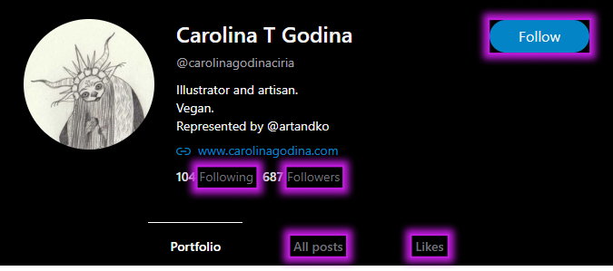
Elements must meet minimum color contrast ratio thresholds (5 errors). 1.4.3: Contrast (Minimum) (Level AA)
- Found via: Automated testing
- Impact:
- Due to the poor contrast between the text color and the background, users with partial visual impairments will find it hard to read text. Users with no visual impairments will also have trouble reading text on devices with low brightness or in environments with very bright light.
Elements with low contrast: the "Follow" button, the "Following" link, the "Followers" link, the "All posts" link and the "Likes" link.
- Due to the poor contrast between the text color and the background, users with partial visual impairments will find it hard to read text. Users with no visual impairments will also have trouble reading text on devices with low brightness or in environments with very bright light.
-
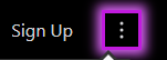
Buttons must have discernible text. 4.1.2: Name, Role, Value (Level A)
- Found via: Automated testing
- Impact: Due to the absence of text in the top-right button of the header, a screen reader user reaching this button will not know what the button does, they will only know that it opens a popup menu. Only users with no visual impairments will see the "3 dots" icon, which communicates that this is an extension of Cara's main navigation.
- Links must have discernible text. 2.4.4: Link Purpose (In Context) (Level A)
- Found via: Automated testing
- Impact: Since this link has no text, the entire URL will be read by screen readers. Fortunately for Cara, they have a short URL, so this issue has a low impact.
-
A "Skip to main content" button should be the first button to receive focus via keyboard. 2.4.1: Bypass Blocks (Level A)
- Found via: Manual testing
- Impact: Keyboard users & screen reader users would greatly benefit from having access to such a button because it helps them skip over the entire header area if they want to get to the main content faster, the same way a user with no visual impairments wouldn't read the menu each time they navigate to a different page. Fortunately, screen readers implement landmark navigation to help when this button is missing, but keyboard only users do not have access to a "Skip to main content" button.
-
The "Explore" link in the header is read as "compass icon graphic explore link". Decorative images should be given an intentionally empty alt text so that screen readers can skip over them. 1.1.1: Non-text Content (Level A)
- Found via: Manual testing
- Impact: Redundant information "compass icon graphic" causing a bad user experience when reading the Explore link
-
The search input should have an accessible name. 4.1.2: Name, Role, Value (Level A)
- Found via: Manual testing (I'm surprised Axe didn't find this automatically)
- Impact: Since this input only uses a placeholder, the placeholder text "Search" disappears when you start typing and this is not ideal. The more pressing issue here is that I couldn't use voice control with the command "Search" because there's no accessible name for this search input and also no visible label. For example, a user with motor impairments using voice commands wouldn't be able to access the search bar easily without using a mouse grid. Mouse grids are very useful, but they don't provide the best user experience to users. Learn more about Microsoft Voice Access.
-
The search input's "clear text" button should be focusable and functional. 2.1.1: Keyboard (Level A)
- Found via: Manual testing
- Impact: A keyboard only user / screen reader user would not be able to clear the search input by using this button that mouse users have access to. Fortunately, they can use alternatives: the Backspace and Delete keys.
-
The search input's dropdown results should be focusable and functional. 2.1.1: Keyboard (Level A)
- Found via: Manual testing
- Impact: A keyboard only user / screen reader user can't reach the quick results dropdown that appears below the search input.
-
The search input should be functional. 2.1.1: Keyboard (Level A)
- Found via: Manual testing
- Impact: A keyboard only user / screen reader user can't press the Numpad Enter key to search. It seems Cara developers hardcoded the search functionality to only work with the main Enter key.
-
The focus order of the elements on the page should follow a logical order. 2.4.3: Focus Order (Level A)
- Found via: Manual testing
- Impact: I was using the search and I landed on the search results page. Then I continued to navigate through the header. I'm not even sure what happened, but hitting the Tab key after focusing the search input sent me to the page's main scrollable container, instead of letting me focus the "Buy Cara a Coffee" link. The screen reader speaks the page title and "document selected". Very confusing.
-
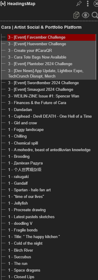
The headings should represent the hierarchical structure of the page. Ideally, a page should have only one heading level 1. 1.3.1: Info and Relationships (Level A)
- Found via: Automation testing and manual testing
- Impact: Finding myself on the Explore page out of curiosity, I couldn't help but notice... this page has some of the worst headings I've ever seen. Multiple headings level 1 are being loaded the more you scroll the page. I used the Headings Map extension to show just how weird this looks. A screen reader user would look up a list of headings and, since this structure makes no sense, they would find a list of jumbled-up headings with no logical hierarchy.
-
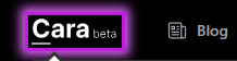
The "Glaze" option in the header popup menu is read as "Glaze logo Glaze". Decorative images should be given an intentionally empty alt text so that screen readers can skip over them. 1.1.1: Non-text Content (Level A)
- Found via: Manual testing
- Impact: Redundant information contributes to a bad user experience for a screen reader user.
-
The links at the bottom of the header popup menu should be reachable via keyboard. 2.1.1: Keyboard (Level A)
- Found via: Manual testing
- Impact: Keyboard only / screen reader users can't reach the links at the bottom of the popup menu. The moment I hit the Tab key to reach the first icon link, the menu closes.
-
Images should have a short descriptive alt text. 1.1.1: Non-text Content (Level A)
- Found via: Manual testing
- Impact: Cara does have alt text for their user's art... but unfortunately it's:
- auto-generated by using ID numbers (e.g. alt text "portfolio-post-df3e76f8-6d2c-47f4-b3b0-298b1929e0da" for the thumbnails in the portfolio view)
- or hardcoded (e.g. "Post Image" in the post view)
And I'm going to stop here, since I think I have what I need to make a point. For the record, this isn't a complete accessibility audit.
Conclusion
Overall, Cara isn't fully accessible. The missing alt text is just the tip of the iceberg, but fixing this would be a good start.
The issues I found can impact people with various disabilities. For example, issues such as missing button text, missing link text, or missing input labels can impact both screen reader users (users that might have visual disabilities) and voice control users (users that might have mobility disabilities).
I am seeing some good practices here and there that help with accessibility, such as:
- font sizes use rem units so that users with custom font settings can enjoy their font size preference
- the website is responsive and zoomable without content loss
- the keyboard interaction in the header menu mostly works
- the "Repost" button's tooltip in the post view is properly read by screen readers
- the focus outline is visible on keyboard interaction
But it seems the efforts aren't organized or consistent. I know that Cara is self-funded and built by a small team of volunteers, but I hope one day it's going to have the resources to prioritize being accessible.
I think addressing these issues and designing, implementing, and testing the platform with accessibility in mind would improve Cara's image and maybe convince more artists to migrate to it. Small incremental changes could be made to make the website more accessible for everyone.